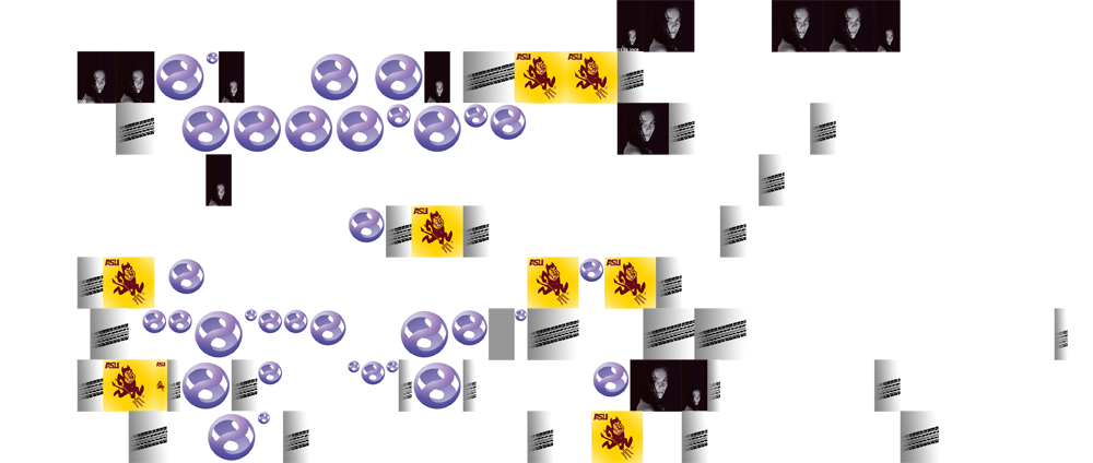
Back in January, I conceived a plan to document and visualize how I spent my time. The project has been tabled for many months, but I’ve recently begun to devote time to it once again.

Back in January, I conceived a plan to document and visualize how I spent my time. The project has been tabled for many months, but I’ve recently begun to devote time to it once again.

This entry was posted on October 28, 2008, 2:51 am and is filed under blogging, self-portraiture. You can follow any responses to this entry through RSS 2.0. You can leave a response, or trackback from your own site.

Fusion theme by digitalnature | powered by WordPress
Entries (RSS) and Comments (RSS) ^
#1 by Jeremy Vaught on October 28, 2008 - 8:04 am
Hmmmmm, I love the idea. But the graphic leaves a bit to be desired. 🙂 I see football, and driving. The avatar is time spent myspacing (since that is your old myspace avatar) and then blowing bubbles? The white space must be sleeping and actually working.
Maybe I should have waited for the legend on a future post. 🙂
#2 by Ms. Herr on October 28, 2008 - 8:48 am
Jeremy, thanks for your comment. It’s actually great feedback about how people may intuitively interpret the map. You are close on most of your assumptions, and dead on about the driving (travel time). The Sun Devil graphic actually refers to the time I spend mentoring and tutoring ASU student-athletes.
The avatar is time spent working on my personal brand, either via content creation or production on projects like this. I will use my current avatar to represent the same thing, but use of old vs. new will be a reflection of when I actually hired Tyson for a specialized social media/personal brand avatar. Time spent on any of my numerous social networks, as well as socializing and networking offline will be represented with a different icon.
The ‘bubble’ is actually the Experience Studio logo, but what a great way to think about my time there.
The white space is either time spent sleeping or doing stuff I don’t yet have icons for including dancing, running, social networking, hanging with the closest of friends, and more.